Lavner Camps Website
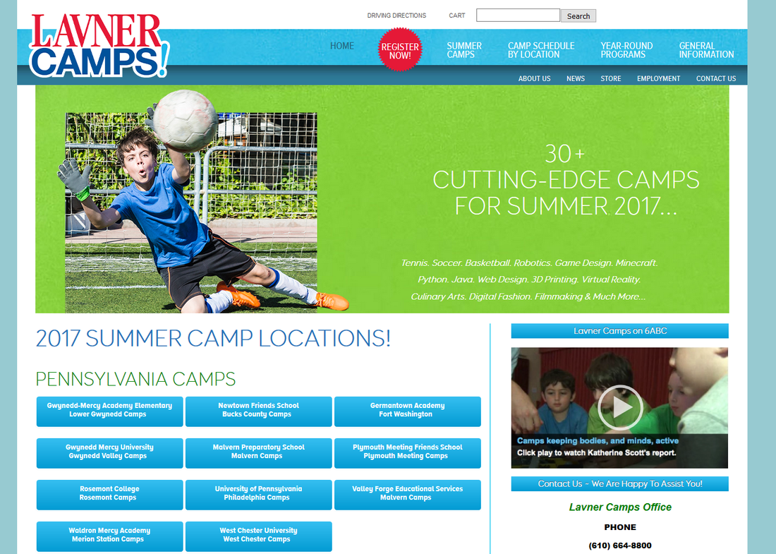
Collaborated with Lavner Camps in redesigning their website with the goal of simplicity, modernity, and playfulness.
First, to make it easy for visitors to navigate, the site utilized a main top menu bar for general information options, a moving slideshow for displaying camp messages, and a grid of friendly blue buttons to navigate by location. All these elements helped achieved the goal of simple navigation by logical path.
Second, the website required a modern feel. To generate this tone, a clean layout was designed with a balanced negative to positive space ratio. Displayed photos were redesigned to pop out in 3D (as shown in the image above) and the font was carefully selected to match modernity.
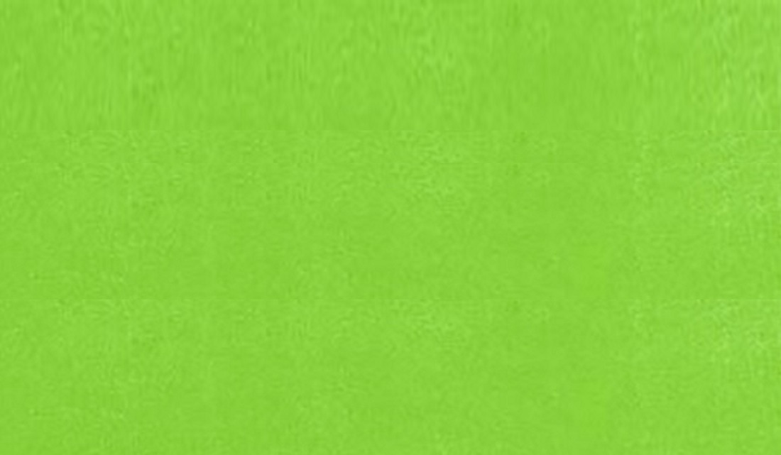
Lastly, playfulness must be presented. This idea was mostly encapsulated through the color palate as well as textures. To avoid an overly digital feeling, a soft paper texture was applied to the green slideshow backdrop bringing the viewer back to that more fun and playful vibe.
Green Texture
|
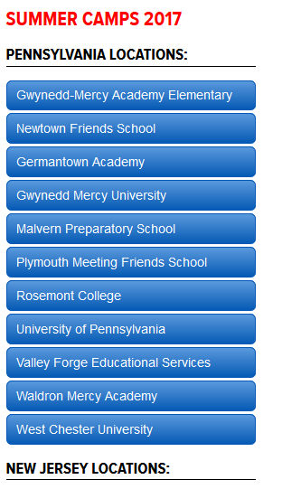
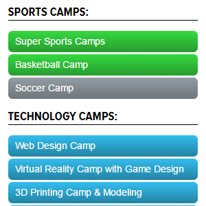
To the side and below are close-ups of the button navigation. Dependent on the category of information (i.e. Location or camp type) the colors were coordinated. A soft fade was utilized behind the pure white text once again working off the negative space and creating a clean but effective button design. When hovered on, the buttons turn to neutral gray making it easy to target.
|


